
ARTCENTER / SEQUENTIAL DESIGN 2 / 2021
The Insider
A legal battle.
A game of chance.
An academic title-sequence concept using a familiar board game to explore greed, risk and the pressure of speaking out.

01 / CONCEPT
The rules are stacked.
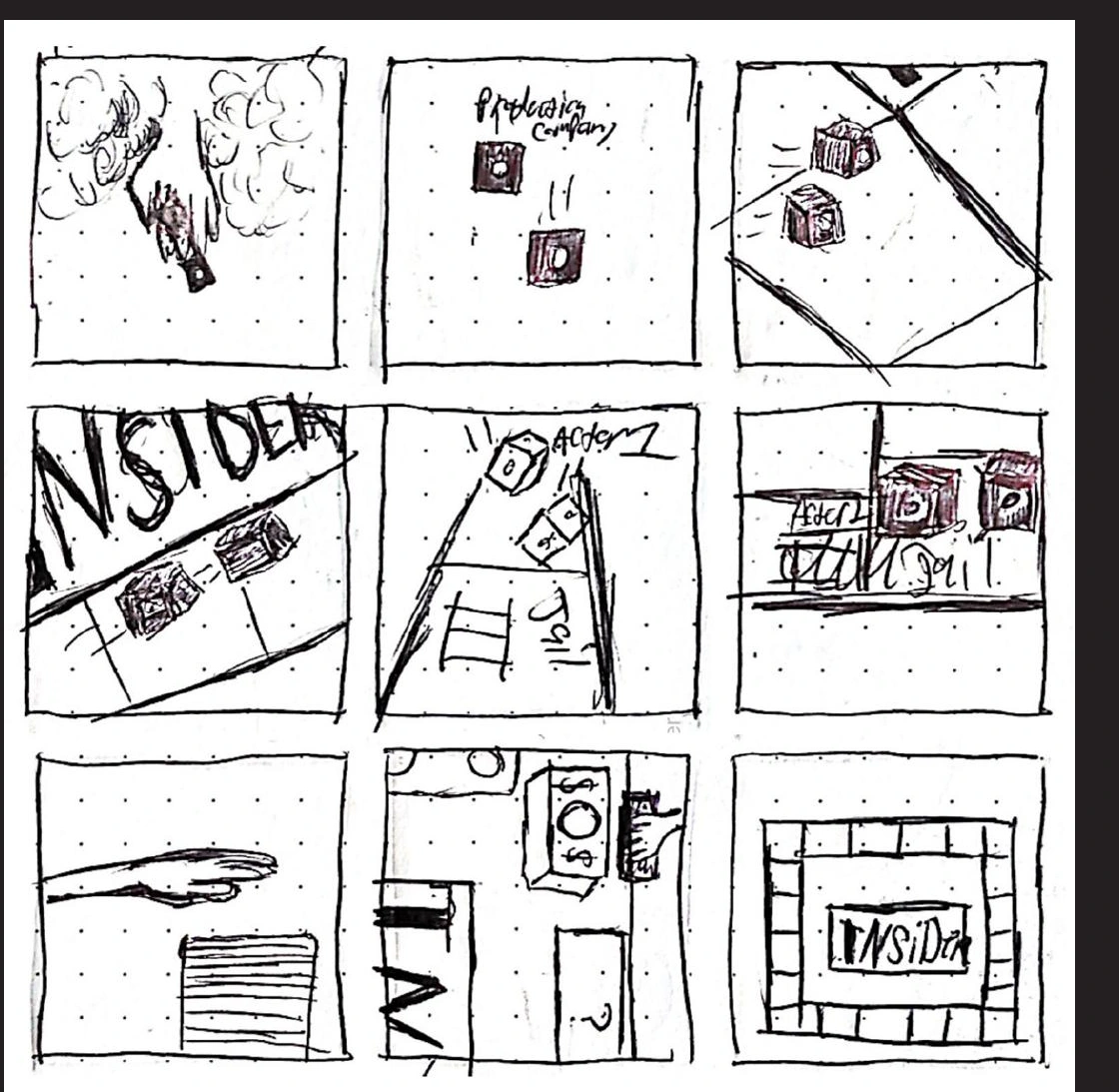
My title-sequence concept for The Insider uses Monopoly as a metaphor for a legal battle shaped by money, power and the threat of punishment. The board, dice and game pieces turn those abstract pressures into a small physical world.
Characters as game pieces
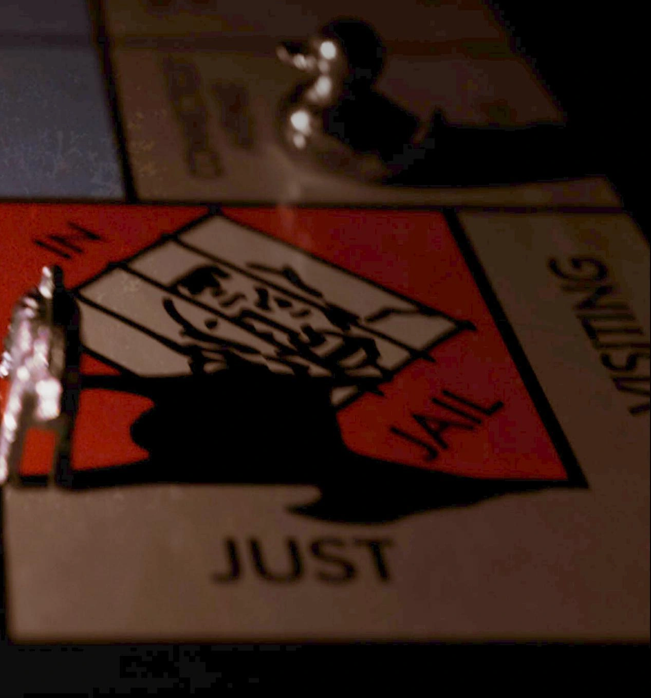
The goat represents Jeffrey Wigand, the duck represents Lowell Bergman, and the dinosaur represents the tobacco company. Their placement and cast shadows suggest the power relationships and threats around them.
Risk as a visual motif
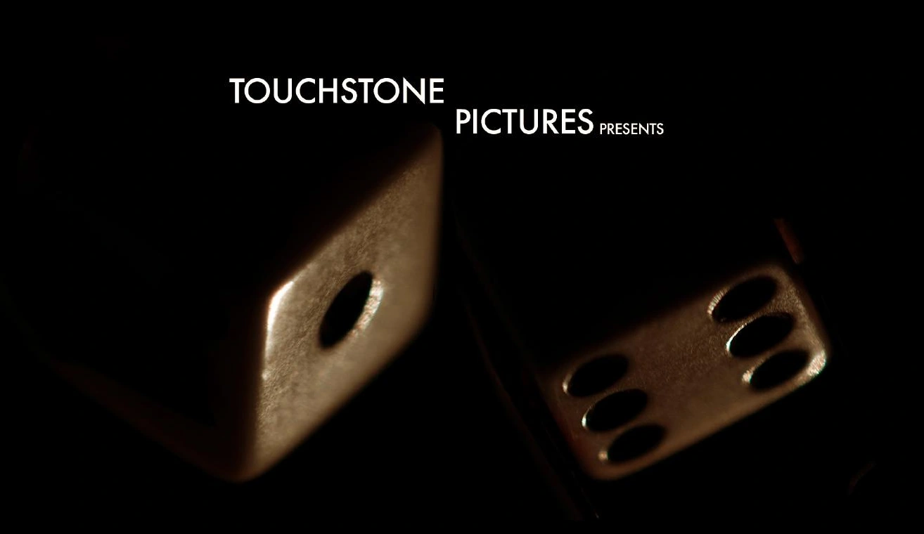
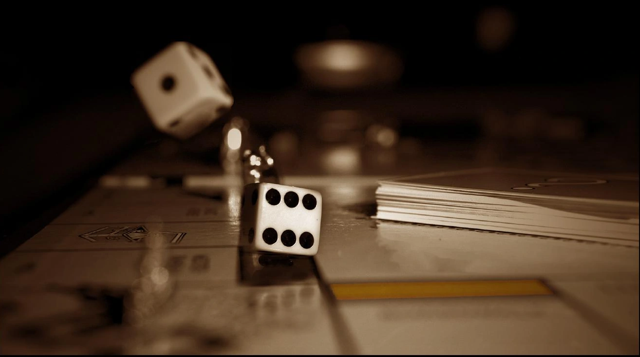
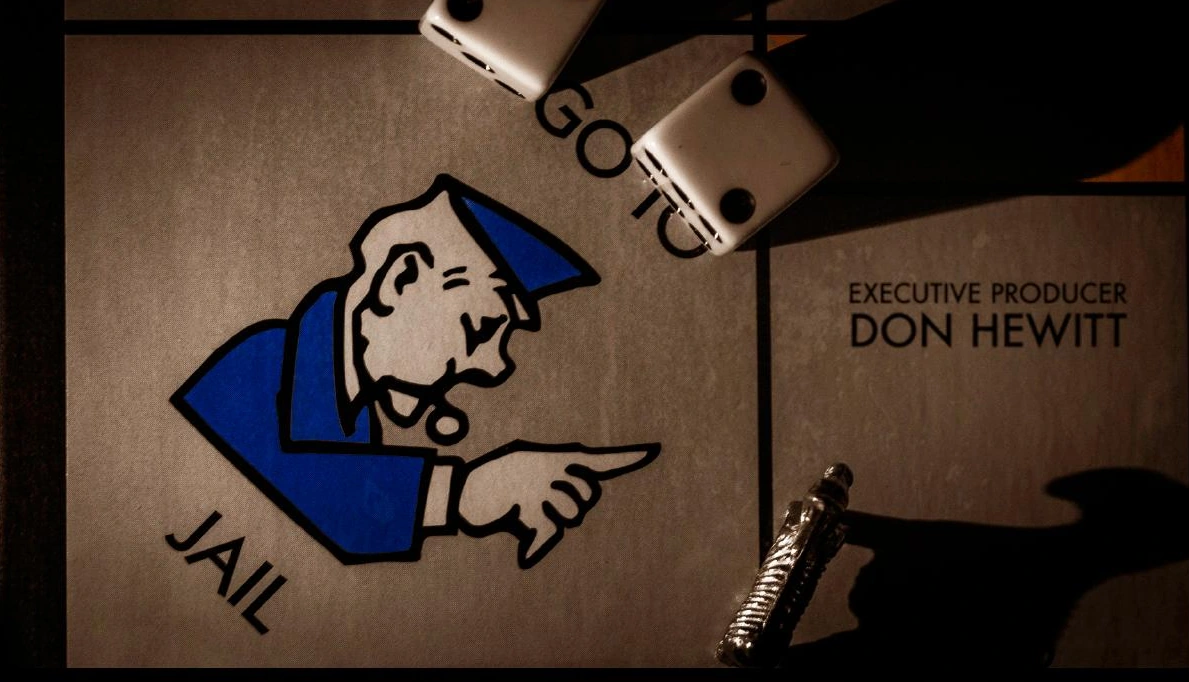
Dice, Chance spaces and the jail square connect the board game’s rules with uncertainty and legal jeopardy. Close framing and slow reveals make familiar objects feel uneasy.
02 / PRODUCTION
A miniature world, photographed.
The imagery was developed with practical materials: a board game, dice, small figures and directed light. Low-light photography, shallow focus and carefully positioned shadows create depth and tension at a tabletop scale.
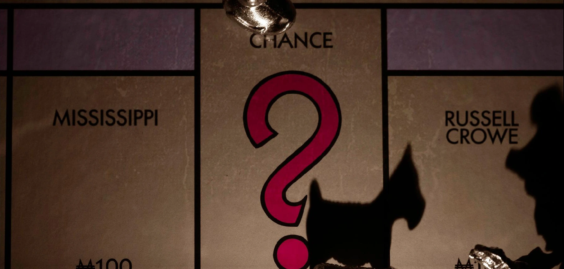
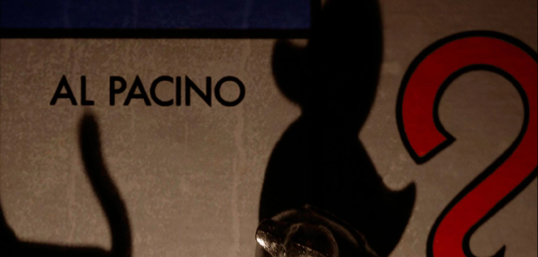
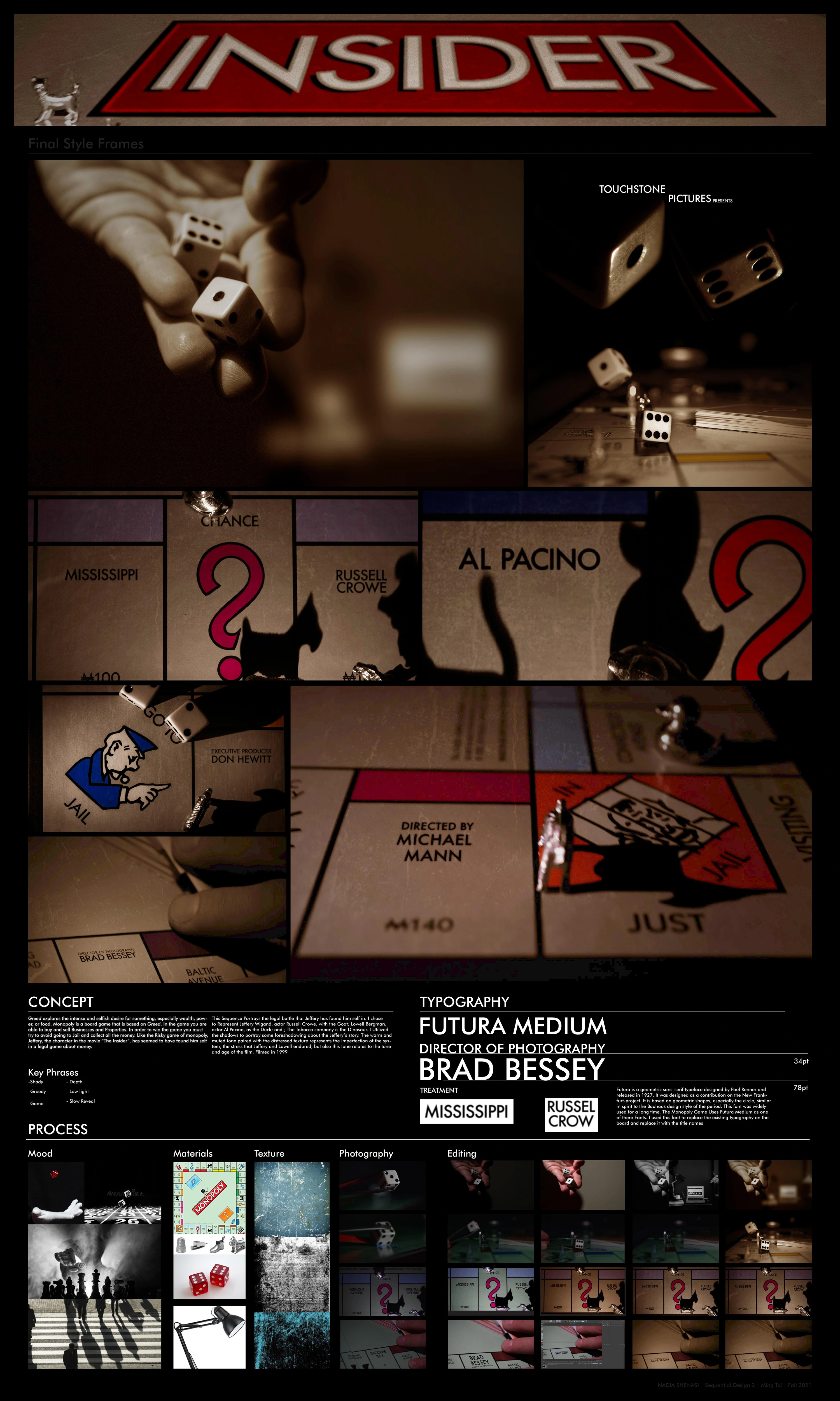
The process documentation records material selection, texture references and photographic tests. I used the physical objects as the foundation, then refined the atmosphere through image editing.
03 / POST-PRODUCTION
Building the atmosphere.
Warm, muted tones and distressed surface textures reflect the stress and imperfections described in the concept. The editing comparisons show the move from cooler source photographs toward the final subdued, cinematic treatment.
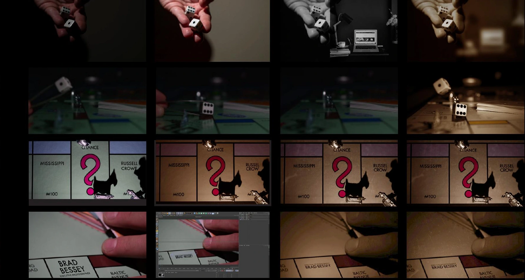
The board becomes the credit system.
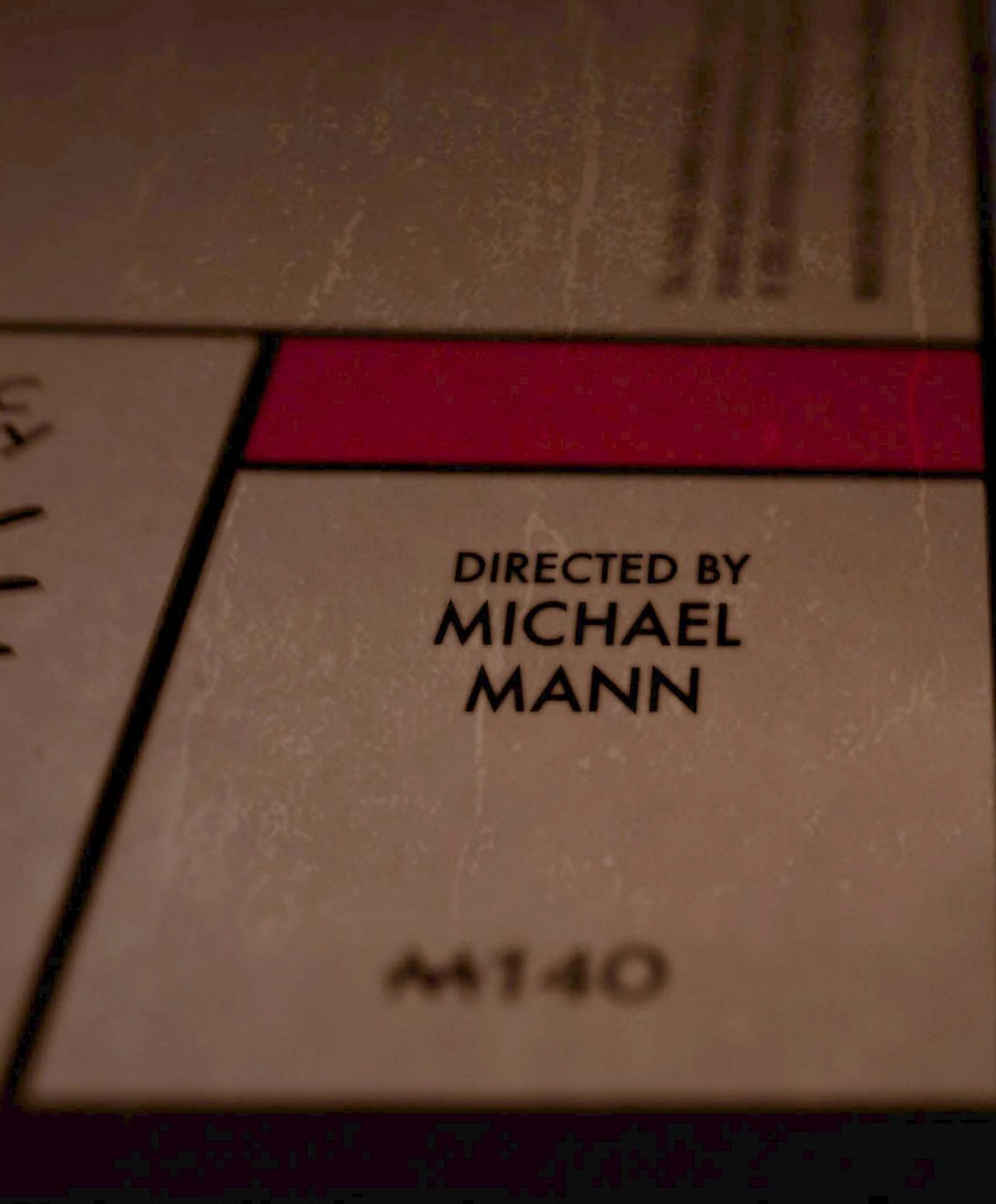
I chose Futura Medium to connect the credits with the board game’s typographic language. Replacing board labels with title credits makes the typography part of the photographed world.
04 / SELECTED STYLEFRAMES
Chance. Pressure. Consequence.
Selected frames trace the visual direction through falling dice, character shadows, legal risk and the final title. These are the developed styleframes documented in the process poster.

PROCESS ARCHIVE
See the complete development.
The original process poster brings the concept, final styleframes, typography, references and editing studies together. Reference imagery within the poster is part of the research documentation.
Open the full process poster
Academic concept for Sequential Design 2, ArtCenter, 2021. Presented as a title-sequence redesign study; no affiliation with the film’s production is implied.