ARTCENTER / TYPE 5 / FALL 2021
Relentless Beats
The desert is relentless.
A concept identity connecting sound, movement and the journey to the festival.
01 / STRATEGY
More than a night out.
This independent academic proposal reimagines Relentless Beats around the desert festival journey: the anticipation, the travel and the shared experience of live music. Research into the existing identity, digital presence and competitors informed a more cohesive system across physical and digital touchpoints.
The starting point
The presentation examines the existing website and social channels alongside Insomniac and Goldenvoice. The design brief called for a clearer visual character and stronger continuity between the brand and its audience.
The proposed direction
Bring sound and movement together in a flexible identity. Desert colour, waveforms and directional geometry connect event promotion with discovery, travel and the on-site experience.
My scope
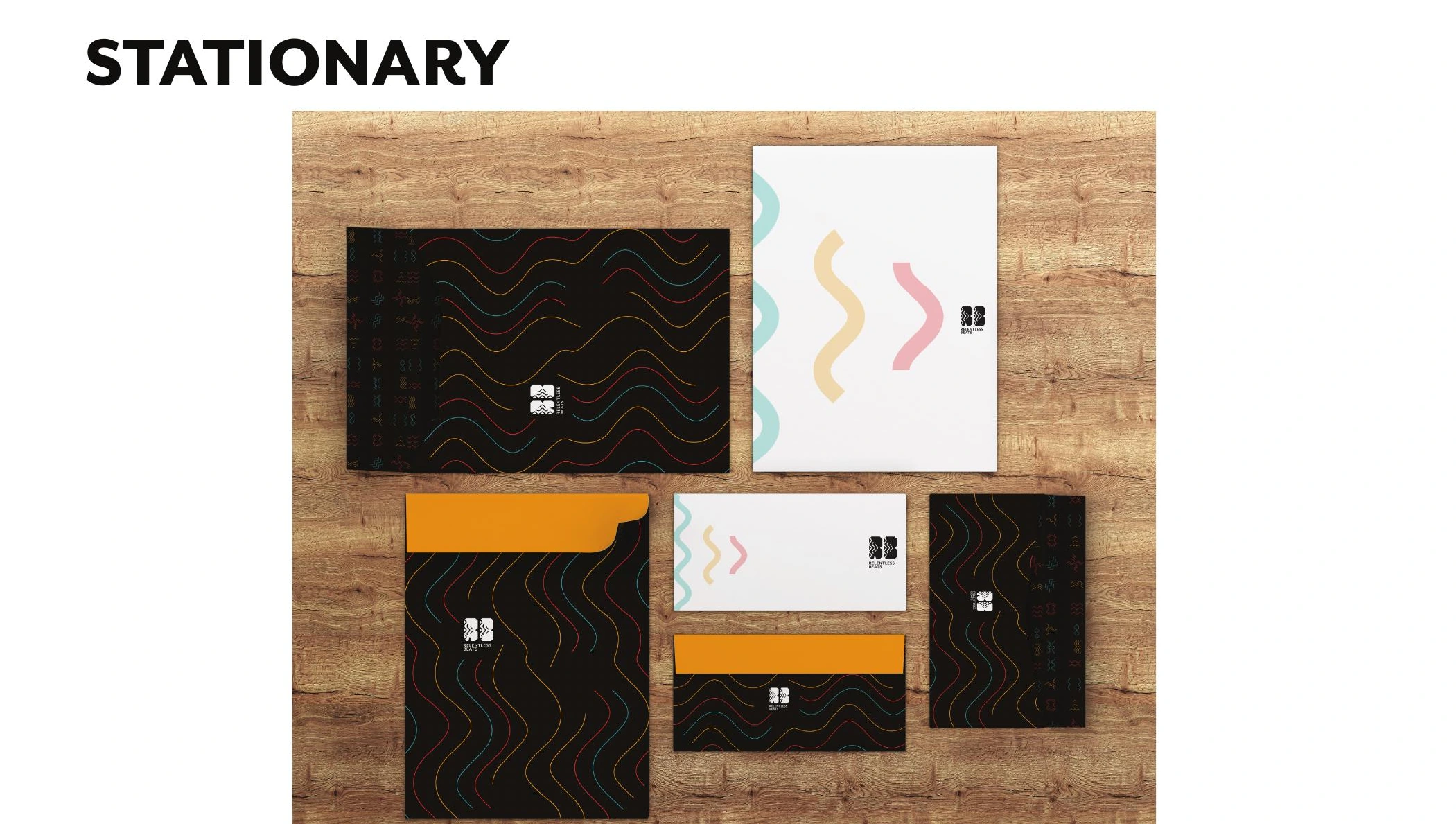
Brand research, logo development, colour and typography, graphic elements, motion design and video editing, digital interface concepts and applications across print, merchandise and environments.
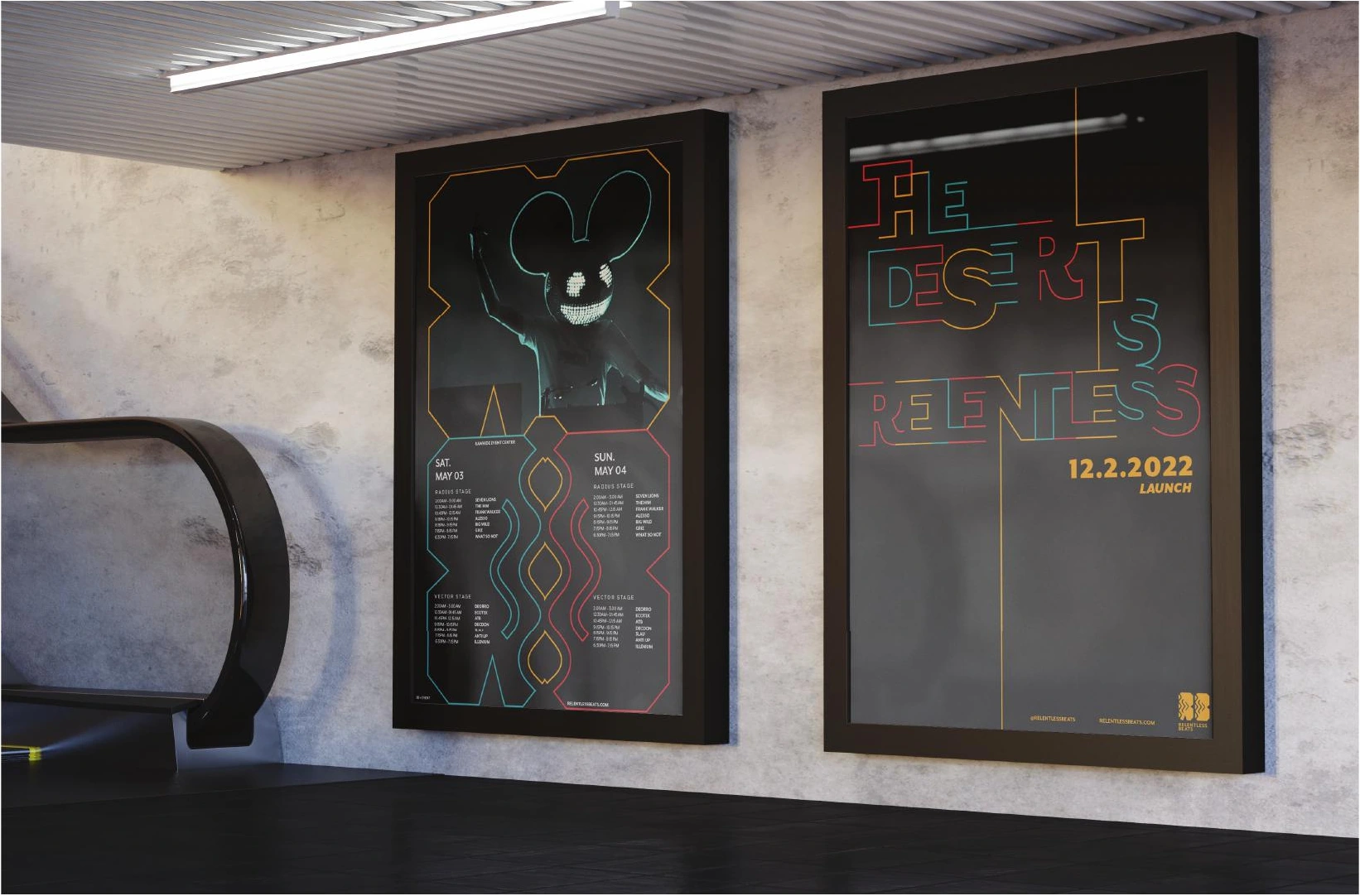
Created for Type 5 at ArtCenter in Fall 2021. Applications shown are proposed designs and mockups, rather than a commissioned or launched rebrand. Dates printed in the artwork belong to the concept campaign.
02 / IDENTITY
Sound becomes a visual language.
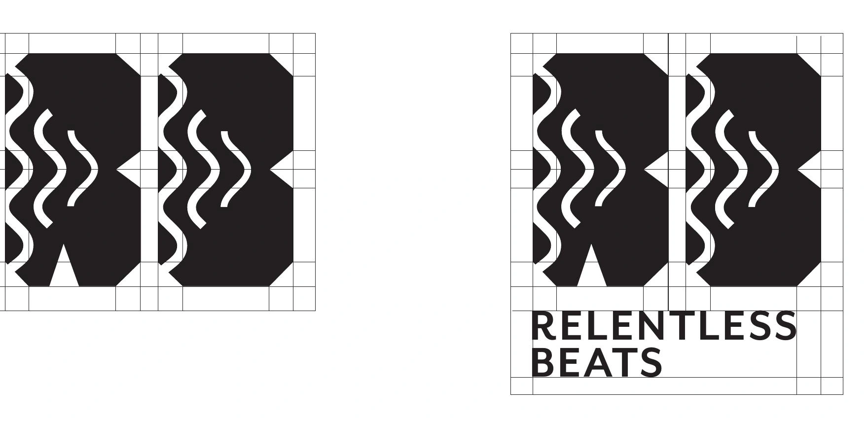
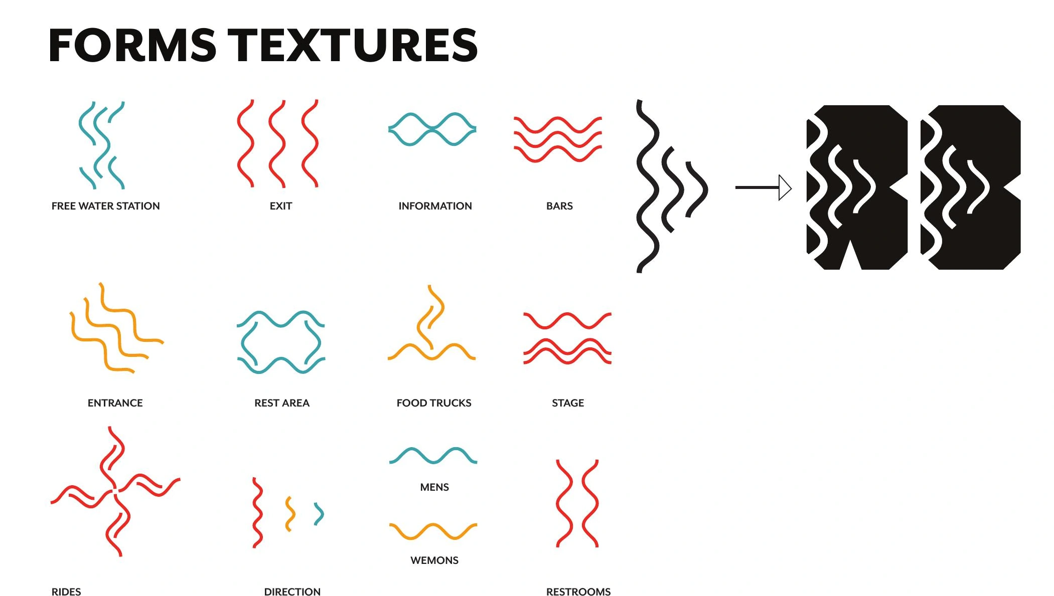
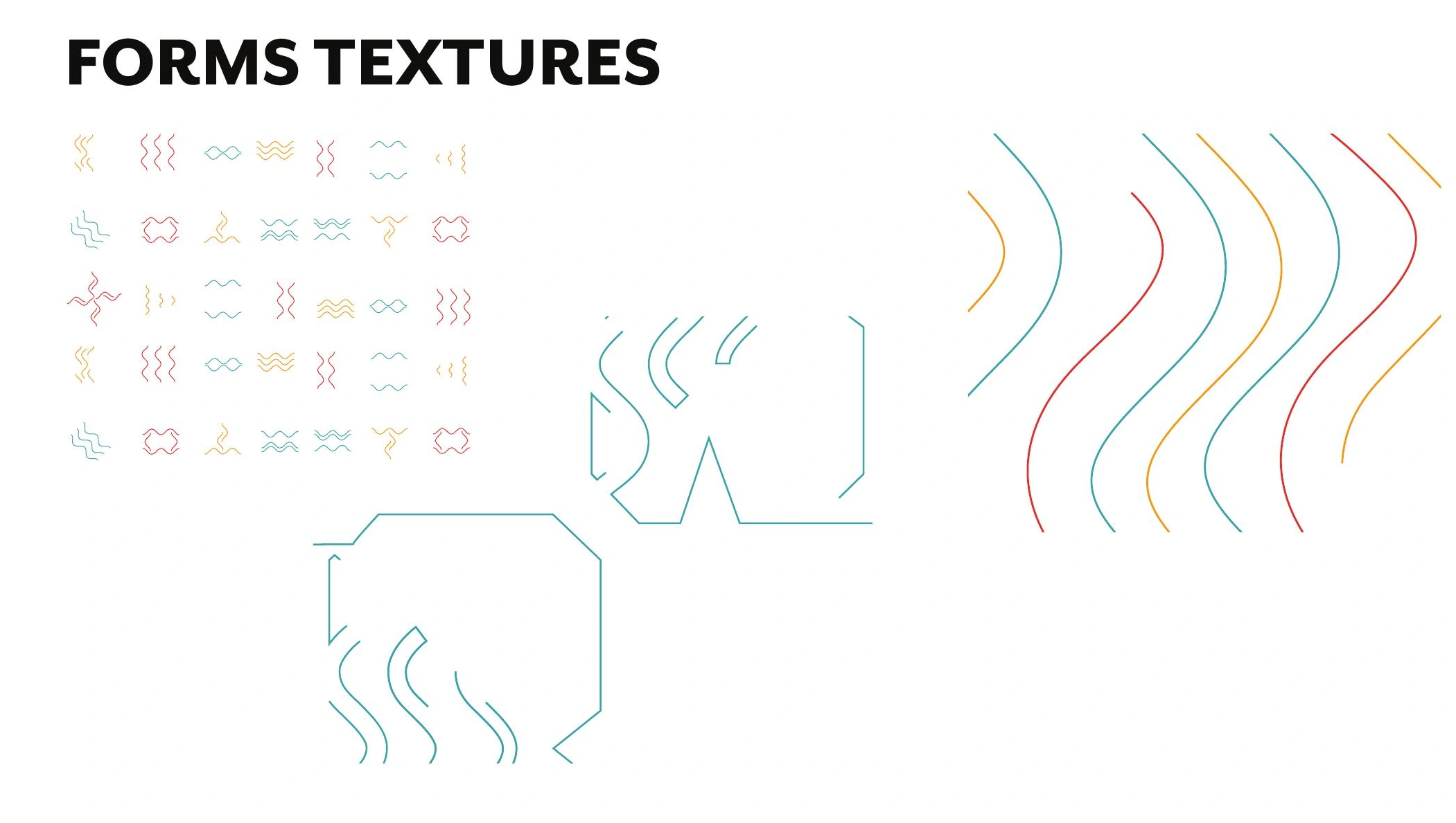
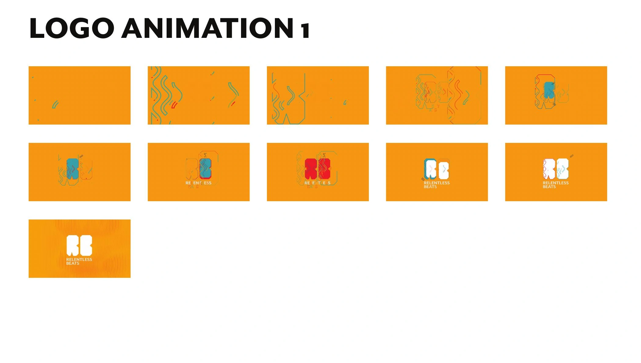
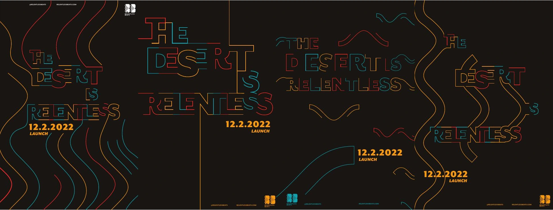
The mark combines the rhythm of a sound wave with the direction of a play symbol. Repeated lines and angular letterforms extend the idea into a system that can expand, repeat and move.
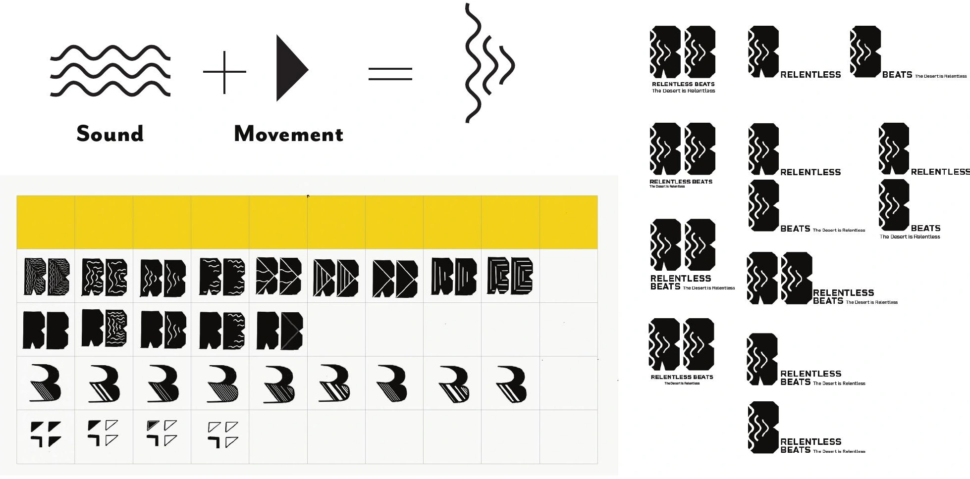
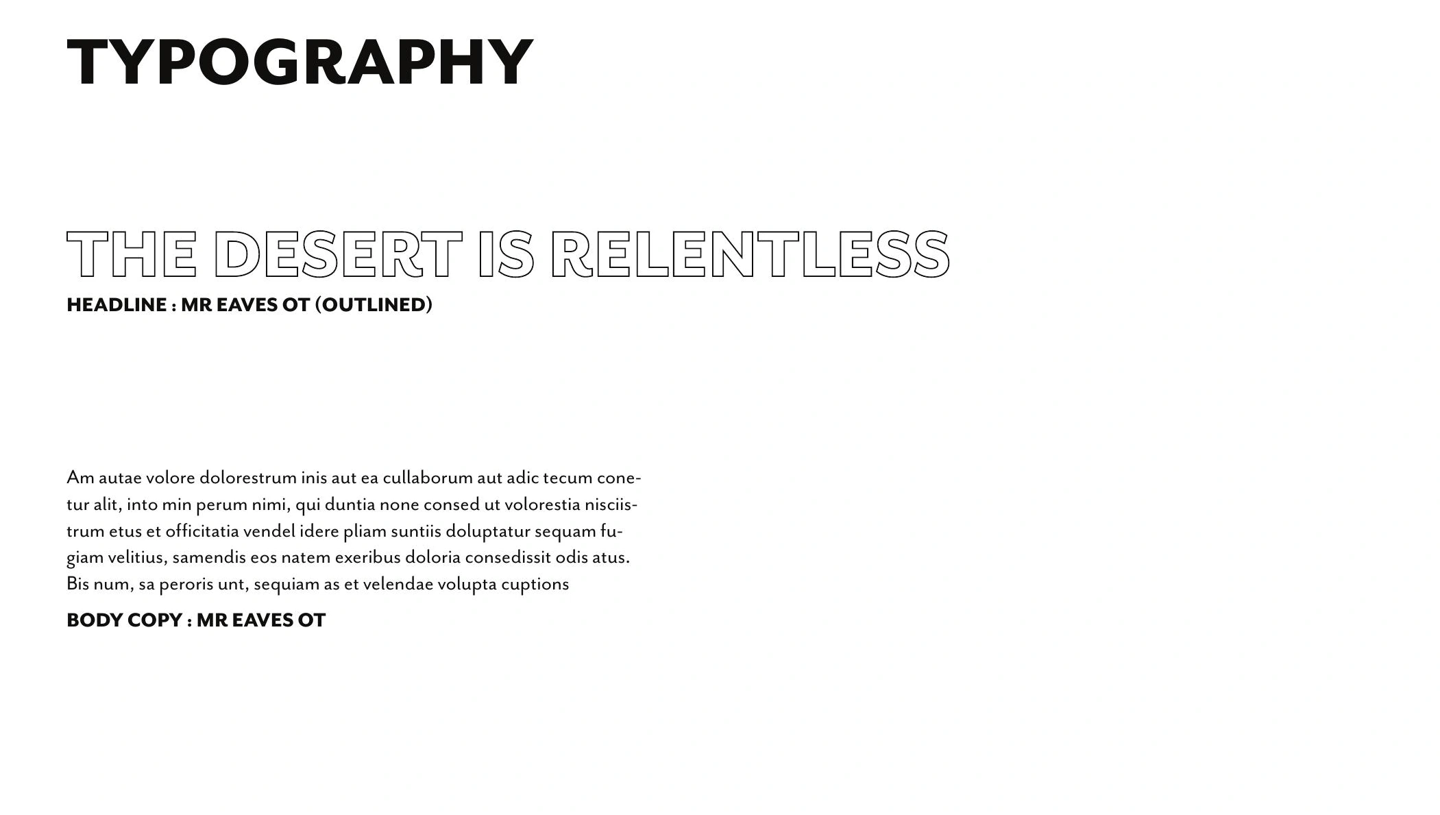
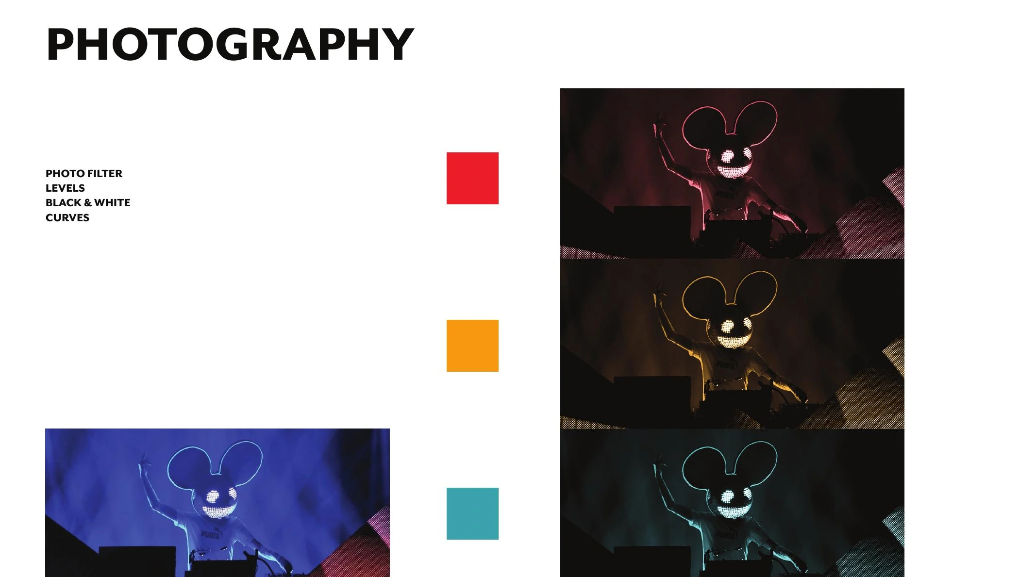
The palette draws from vibrant desert colour, combining red and warm yellow with a contrasting turquoise. A near-black ground holds the coloured outlines together. The typography system pairs outlined Mr Eaves OT headlines with solid body text.
03 / MOTION & PROCESS
From waveform to moving image.
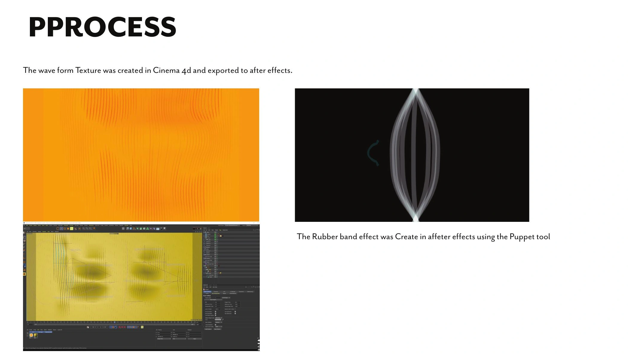
I edited the rebrand video, bringing the animation and brand applications together into a finished sequence. Motion studies translate the identity’s elastic lines into animation. I created the waveform texture in Cinema 4D and brought it into After Effects, where the Puppet tool produced a rubber-band effect.
Solving the tracking shot
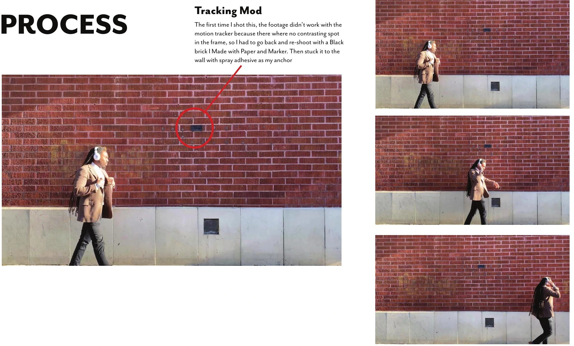
The first shoot did not provide enough contrast for the motion tracker. I reshot the footage after making a black paper marker and attaching it to the brick wall as a tracking anchor. The process shows how a practical change on set supported the compositing work.
04 / APPLICATIONS
One identity. Across the experience.
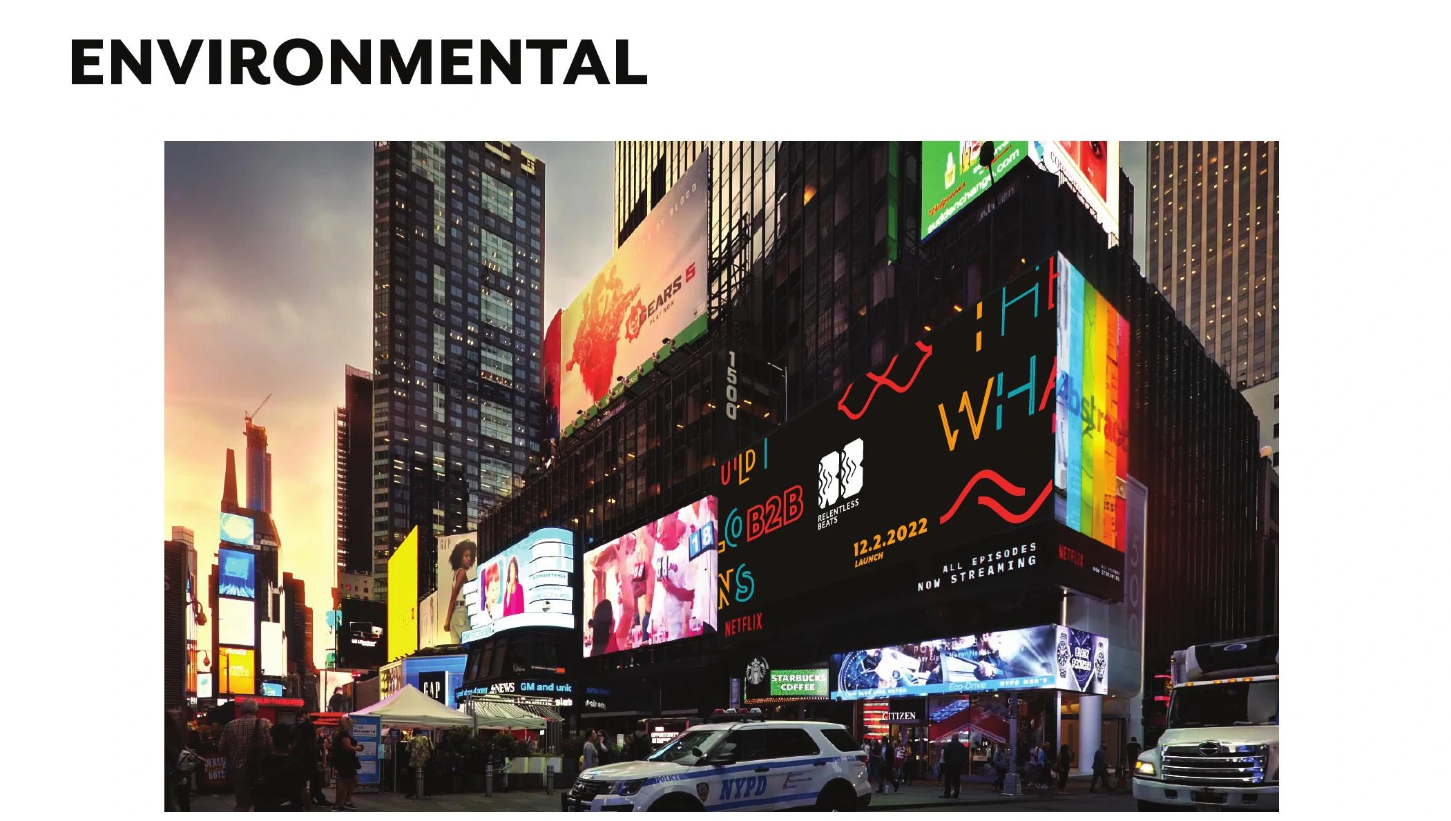
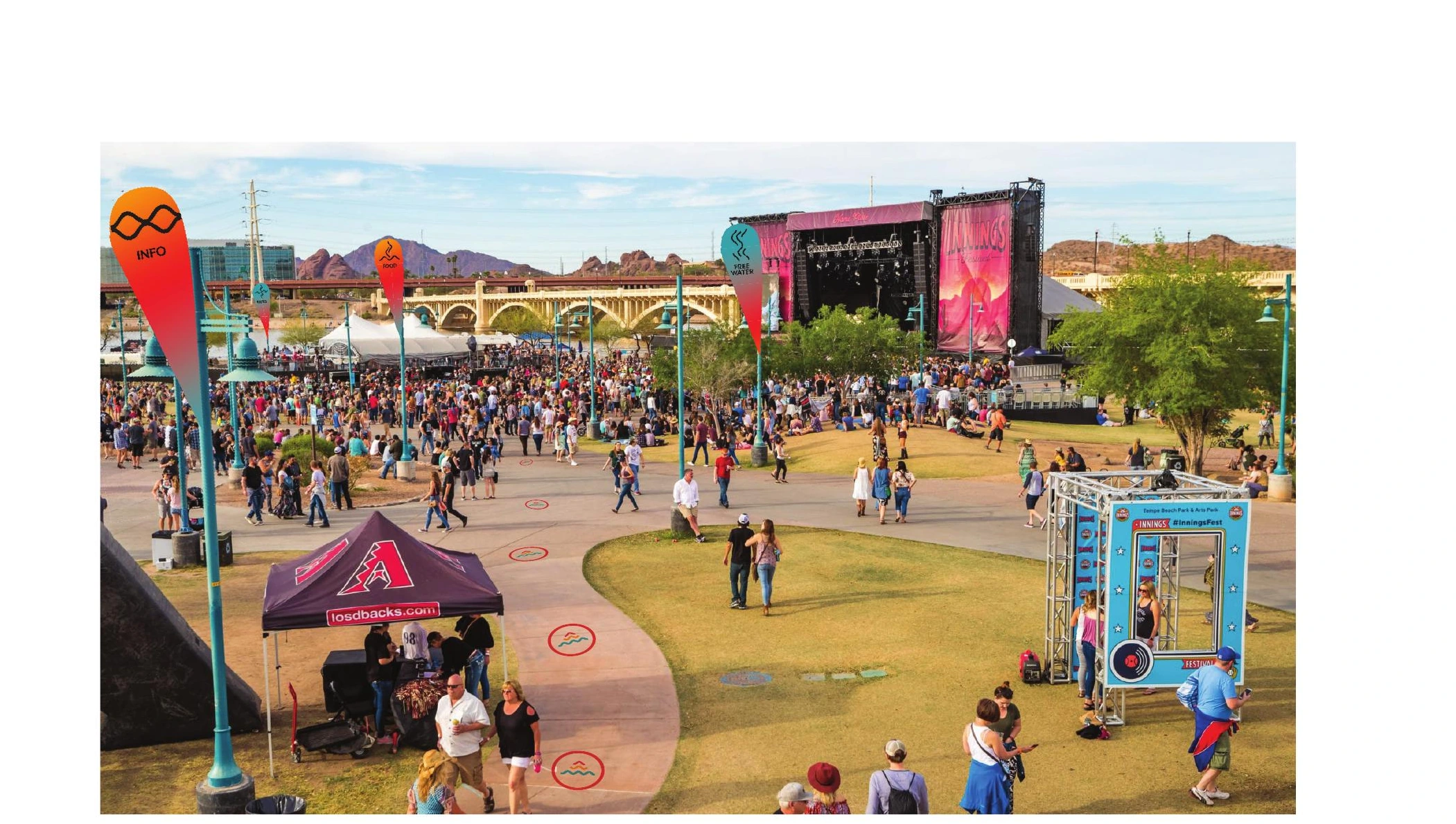
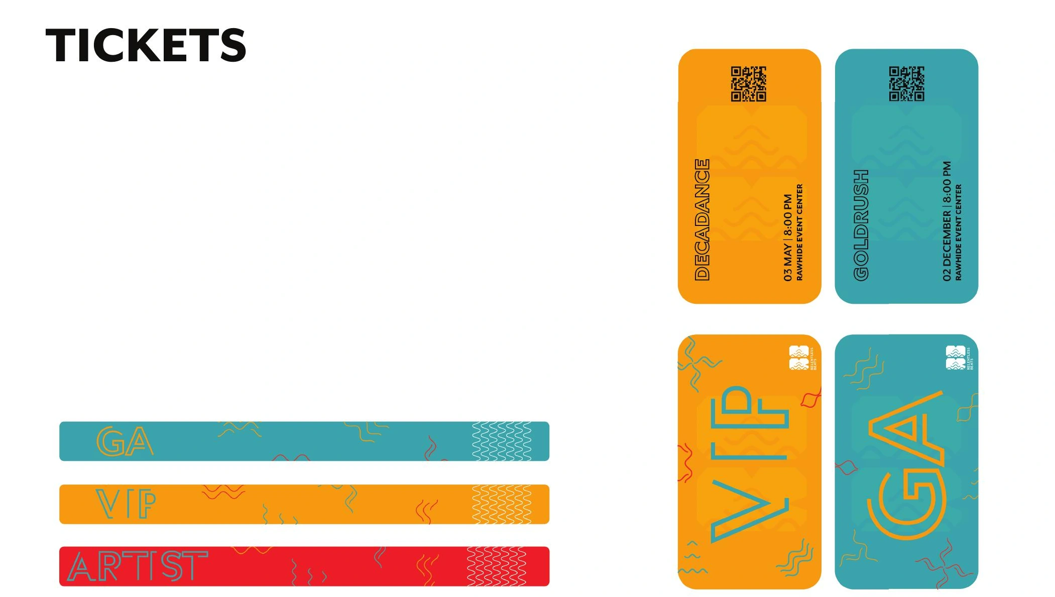
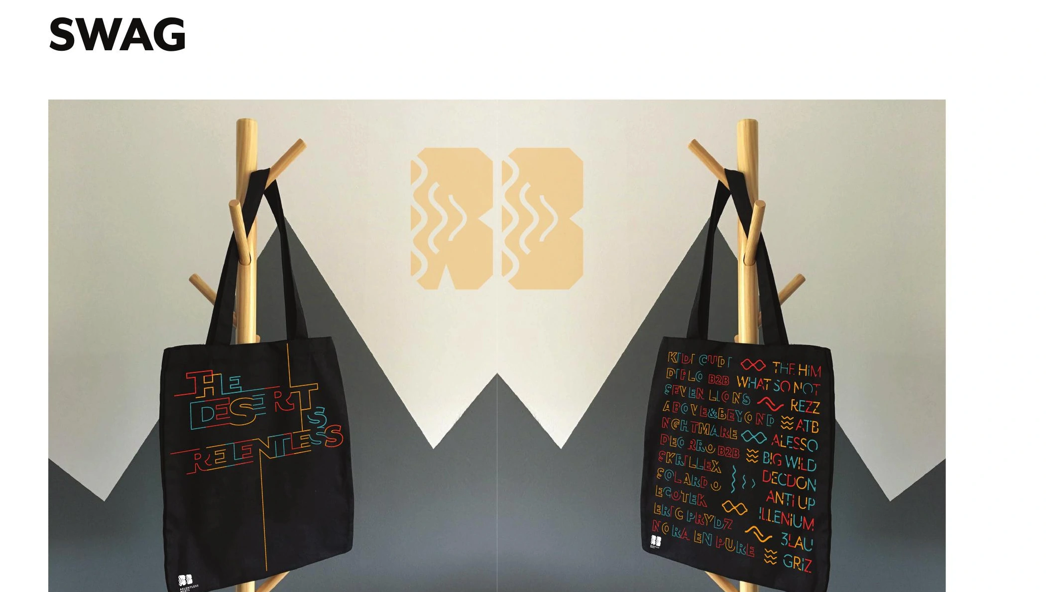
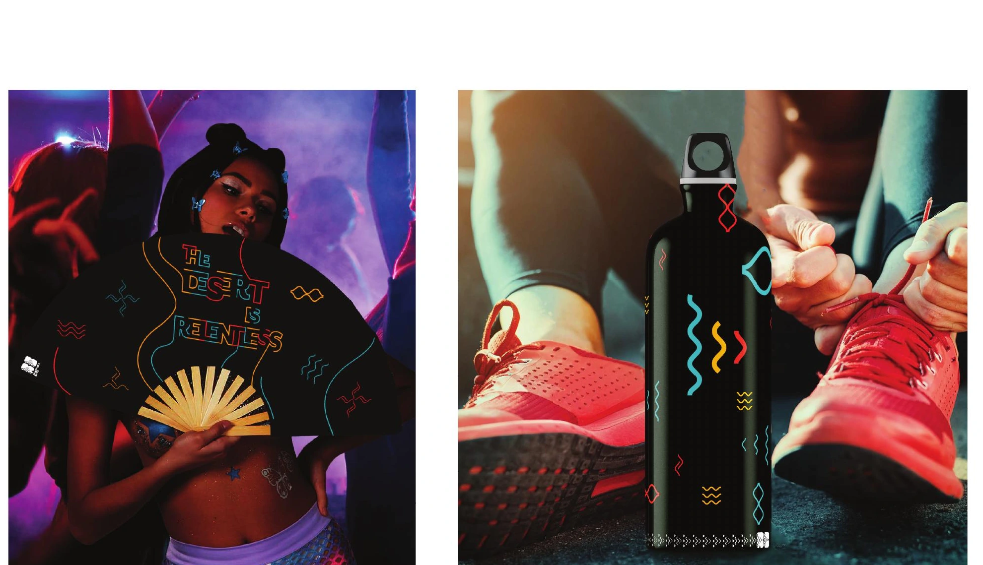
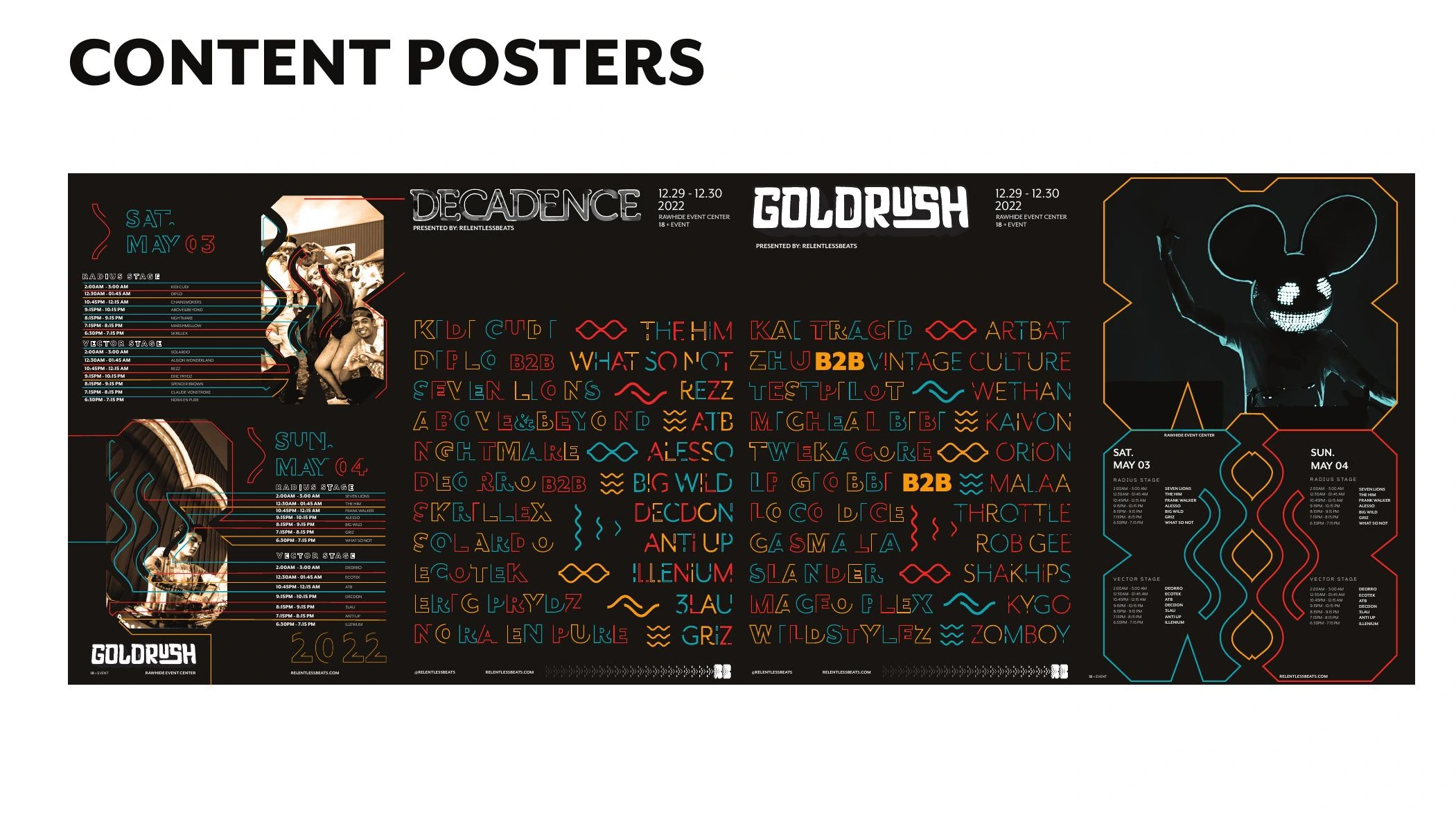
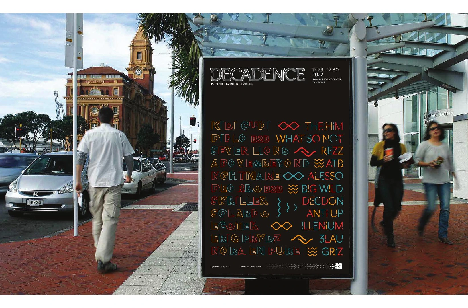
The system carries from anticipation to arrival: identity posters and event lineups, artist discovery on screen, then tickets, wayfinding and merchandise at the venue.
A connected digital presence
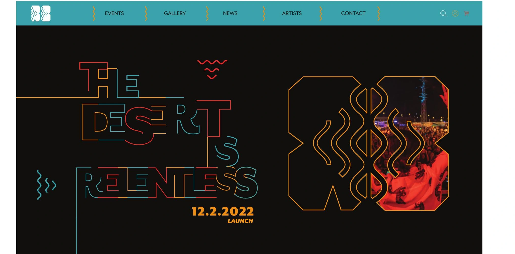
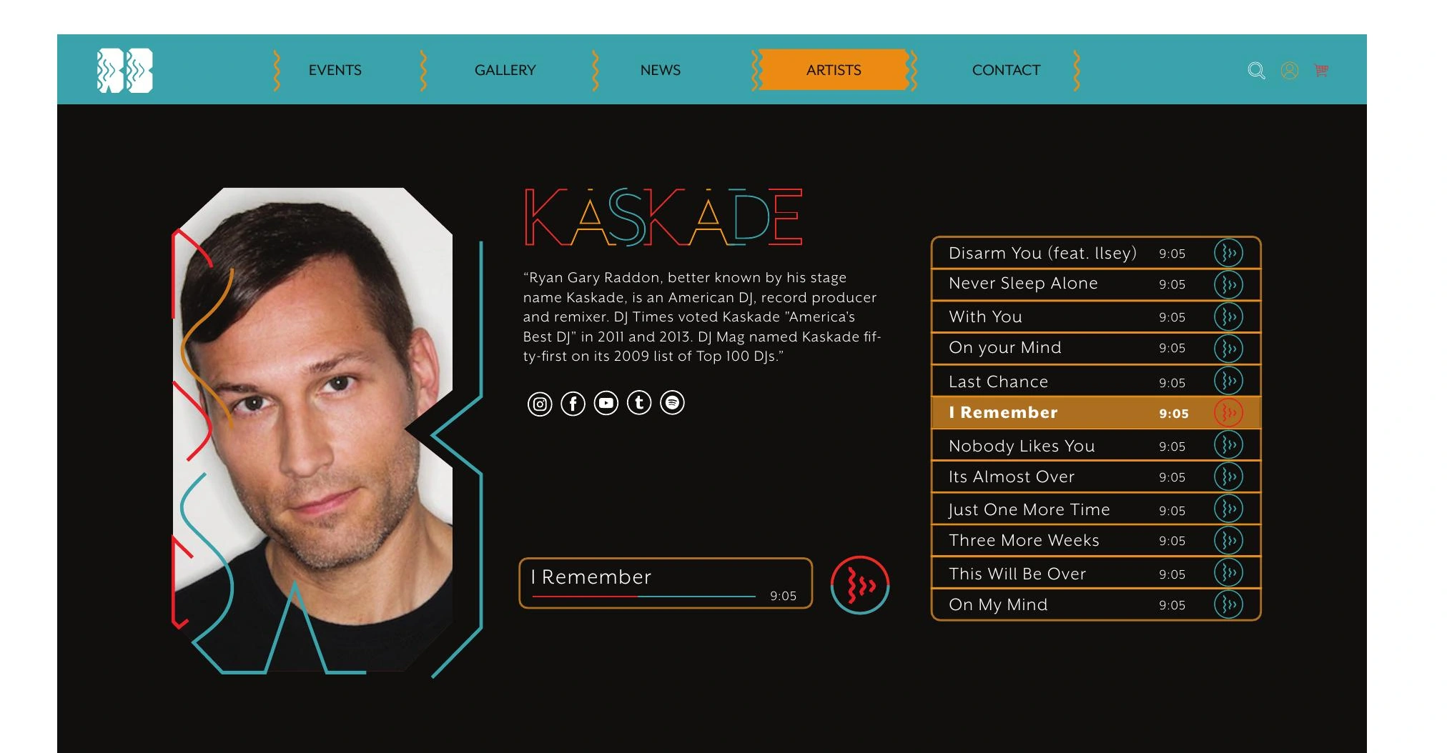
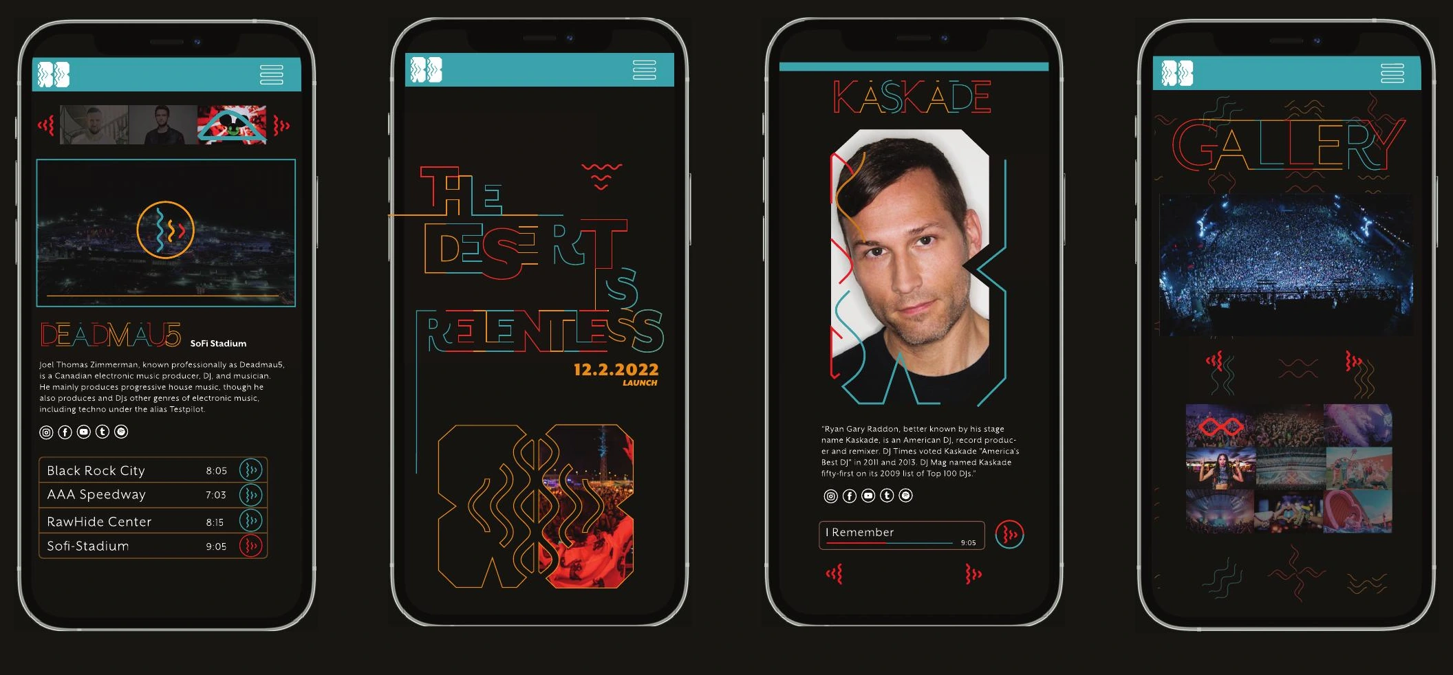
Website and app concepts extend the identity into artist profiles, music, event information and a gallery.
Beyond the screen
Environmental and physical applications explore how the identity could carry through the festival experience.